It’s like a [su_tooltip style=”dark” position=”north” content=”This is a link to ‘Seven-segment display’ on Wikipedia“]seven-segment display[/su_tooltip]. But horizontal, so it’s on its side. But rotated, so it’s normal again. That’s what 7HR means—it’s 7-segment display horizontal rotated. So, the previous alphabet would be called 14N—it’s 14-segment display neutral. Seven segments is a lot less than 14 segments, so that’s already a great advantage of the new alphabet. In fact, I’d say it’s an upgrade across the board with only one minor drawback—that drawback will be explained later.
A horizontal seven-segment display (7H) works well for my alphabet.

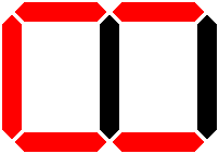
Let’s looks at lines for place of articulation—place lines.
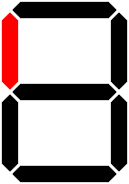
It has a labial line, representing articulation at the front of the mouth (i.e., lips).

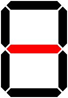
It has a coronal line, representing articulation in the middle of the mouth.

It has a dorsal line, representing articulation at the back of the mouth.
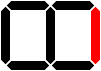
Like 14N, all three lines are used to represent laryngeal articulation.

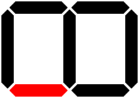
Now, let’s look at lines for manner of articulation—manner lines.
It has a nasal line, representing the position of the nasal cavity.
It has plosive lines, representing stopped airflow when used with a place line.

It has a fricative line, representing partially restricted airflow.
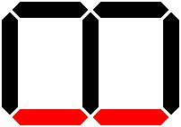
It has liquid lines…

…and approximant lines—both with partial lines reflecting partial turbulence.
![]()
It has transition lines, representing the transition with opposite partial lines.
![]()
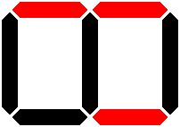
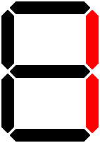
To create a consonant letter, a place line and manner line are used together.
This is a labial plosive—i.e., «p».
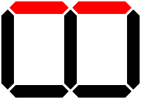
Finally, let’s look at vowel lines. These only use four segments.
It has a close line.

It has a mid line.
It has a front line.

It has a back line.

It doesn’t have an open line or a central line, despite having an open central vowel—i.e., «a». This is because «a» is so common and is often reduced, so I wanted it to be very minimal . So, the entire open central vowel is just one line.

Otherwise, to create a vowel, a close or mid line is used with a front or back line.
It could stop there, but it doesn’t. Unfortunately, 7H has two drawbacks: (1) when put into syllable blocks, «l» and «y» are hard to distinguish, and (2) it’s horizontal even though seven-segment displays are used vertically.
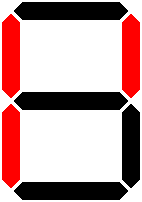
So, I rotated each letter 90° clockwise, which gives me 7HR. Of course, this has one major drawback: it distorts the featural system. There is still a one-to-one correspondence, but the labial line is now the top line…

…and so on and so forth.
Labial, coronal, dorsal, and laryngeal place lines.


Nasal, plosive, fricative, liquid, approximant, and transition manner lines.


![]()
Close, mid, front, and back lines, and the open central vowel.


Of course, just tilt your head back and all of the letters will still make sense. So, they are functional and I’d say they retain 90% of the featural symbolism. Again, the lines still have a one-to-one correspondence that maps out to the vocal tract, but it is a bit distorted.
So, here’s the labial plosive—i.e., «p».

The actual font is coming soon! I haven’t had the time to churn that out while moving into my new home (and enduring two and a half days of 80 °F heat because the capacitor on the HVAC condenser died). Plus, I also have a new new way of forming syllable blocks—the old new way was for 14N and was outdated by the new new way for 7H/7HR.